How to avoid paragraph gaps when using superscript and subscript
TL;DR: The default superscript and subscript styles leave awkward gaps in the text, but you can easily fix the problem with just a few lines of CSS.

Image credit: Fabien Barral
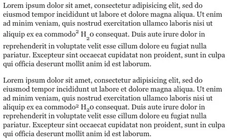
Frequently, when I see a webpage with superscript or subscript text, I see associated gaps in the paragraph. This is caused because the default way browsers render super and subscript text is to add enough vertical space in the paragraph to show them. The result is ugly, but as you can see in the following screenshot, you can easily fix the problem with just a few lines of CSS.

In the first paragraph, you can see the layout gap problem, and in the second paragraph, you can see the paragraph as it should be displayed, by using the following CSS rules.
sup {
  vertical-align: baseline;
  position: relative;
  bottom: 0.33em;
}
sub {
  vertical-align: baseline;
  position: relative;
  bottom: -0.33em;
}
The browser shifts the super and subscript text by using the vertical-align CSS property, which leaves gaps in the paragraph. By resetting this property to the default value of baseline, we get rid of the gaps. Then we restore the appearance of the text by using position: relative; and shifting the bottom up or down by .33em. Since this uses ems, you can use these lines in your reset stylesheet, no matter what font treatment you use on your site. Now go forth, and may paragraph gaps never plague you again!