Do Siegel’s Seven Deadly Sins Hold Up?
TL;DR: In 1996, David Siegel’s book Creating Killer Web Sites was at the top of the charts on Amazon, and it quickly became the gold standard of web design books. Siegel may not have been the first to write...
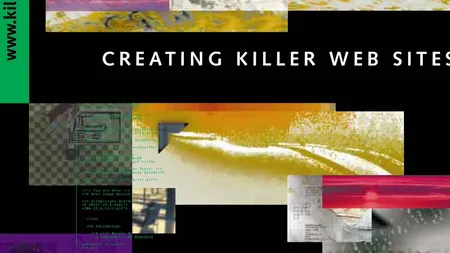
In 1996, David Siegel’s book Creating Killer Web Sites was at the top of the charts on Amazon, and it quickly became the gold standard of web design books. Siegel may not have been the first to write about spacer gifs, slicing images, and table-based layouts, but he certainly popularized the techniques.
He discussed the evolution of the web from through three generations of design. “First generation” sites were bare-bones hypertext documents with headlines and wall-to-wall text. “Second generation” sites added images, but still presented very limited layouts. In Siegel’s opinion, “third generation” sites were the first to be able to apply design to the web, even if they had to abuse tables to do so.
The technology of the web has changed dramatically in the more than 20 years since it was published. Still, parts of the book have aged well: Siegel’s overall message is that design matters, even if it can be challenging on the web. That idea, that it’s worth learning how to work with the toolset of the web, has stuck with me my entire career.
At the time, my favorite part of the book was a series of brief inserts scattered through the book, titled the Seven Deadly Sins of Web Design. I thought it would be fun to revisit them now and see how they’ve held up over the years.
Deadly Sin Number One
Blank-Line Typography
In second-generation typography, site designers let the browser’s default style sheet add a blank line of space between paragraphs properly marked with
<p>tags. In third-generation typography, site designers use indents, no matter what it takes to make them.When you use blank lines as paragraph separators, the meaning of the blank line goes away. It turns into punctuation. In third-generation typography, indents separate paragraphs, and the right amount of vertical white space – maybe a blank line, maybe a bit more – separates sections, clumping paragraphs into logical groups for better reading. Without this effective tool, blank lines escalate the situation, so you need something louder (say, a horizontal rule), to indicate a major break in the flow of text. This kind of unsubtle typography escalates until we see web pages that are full of nothing more than separators.
Of indents, typography Jan Tschichold said, “So far, no device more economical or even equally good has been found to designate a group of sentences. There have been no shortage of attempts, though, to replace an old habit with a new one.”
I remember being taught this in my graphic design classes as well. In the 90s, the prevailing thought was that a blank line between paragraphs was an unfortunate technical constraint. As soon as we gained the ability to indent the first line of a paragraph, we could fix this typographic flaw. Certainly, that’s what Siegel was advocating for.
However, by the time CSS became widespread enough to let us fix it, an entire generation had grown up with the web and become accustomed to it. Some die-hard typographers still advocate for indenting, but the vast majority of sites use blank lines between paragraphs.
At this point, the only real reason to indent is to deliberately make a visual reference to print design, to give your page a more “literary” feel.
Score: 0/7
Deadly Sin Number Two
Horizontal Rules
Horizontal rules are a weak substitute for proper hierarchy and organization of vertical space on web pages.
There are millions of horizontal rules on the Web, doing nothing but taking up space and breaking the natural flow of pages. Horizontal rules are not spacers, they are barriers.
The only time they are useful is in very crowded newspaper front pages, where space is so tight that the proper amount of white space is too “expensive.” Newspapers need to resort to these kind of compromises; web pages don’t.
If you don’t remember 90s design trends or never spent much time on Geocities, this particular sin may be confusing to you. What you need to understand is that site building tools of the time often shipped with a collection of clip art. They would include dozens of whimsical divider lines to separate sections of your page. There were entire sites that just collected horizontal rule images such as caution tape, dancing gophers, or animated rainbows.
However, the problem wasn’t the horizontal rule, it was the use of clip art graphics that had nothing to do with any broader design aesthetic for the site.
Today, horizontal rules are not used nearly as often. When they are, modern design trends usually call for a hairline-thin gray line, to avoid distracting from the content.
Score: 1/7
Deadly Sin Number Three
Background Images That Interfere
Backgrounds on the Web have reached epidemic proportions. Wallpaper is nice, but reading the handwriting on the wall can cause damage to the retina.
People use background images because they add a “theme” to the page, or because they “fill up all that unused space.” It’s the kitchen-sink school of page design, which often escalates to homicidal (not killer) site design. Backgrounds do more damage to web pages than almost anything else.
Thoughtless designers get carried away, the pixels fly, and surfers get hurt. The only good background is a solid or nearly solid color: gift wrap makes bad stationary.
This is a continuation of the last point, where Siegel is reacting to Geocities-style, wildly distracting backgrounds that made it hard to read text. Again, he was proven right as design trends moved reasonably quickly away from using busy background images.
Score: 2/7
Deadly Sin Number Four
The Slow Load
Conversations among friends can survive long silent pauses, but few web pages can afford to take long to load.
A good rule is that most pages in a site should be under 30K, a few can be 30-50K, and perhaps one or two can weigh in at 70K. Pages larger than that should either belong to 800-pound gorillas or be put on a diet.
If you want to force your visitors to go out to lunch while your page loads, fill it full of 8-bit dithered GIFs in the foreground, and don’t forget an enormous high-quality JPEG in the background.
Spread out heavier loads by reusing elements cleverly; once loaded, they are cached and therefore load again almost instantly.
Woof. Siegel seems extraordinarily prescient on this one. Page speed has only continued to grow as a problem over the last 20 years, and today the average page clocks in at over 2MB!
On the plus side, I would say that web developers as a whole are much more aware of the importance of performance and page speed today, if only because it’s a factor in search engine ranking.
Score: 3/7
Deadly Sin Number Five
Illegal Use of the Third Dimension
Bevels and drop shadows have taken over the Web. Buttons, type, tables, interfaces: Everything has beveled edges. I call it downloadable chrome. It fills up space. It makes buttons look clickable. It makes programs look like VCRs and the Web look like an arcade. I recommend not using beveled, 3-D look unless it’s absolutely essential, which means I use it with drop shadows when necessary and single-pixel bevels in rare circumstances.
This one is fascinating. Siegel was complaining about this in ’96, well before the release of the first iPhone, which was the peak of the skeuomorphic design trend. Thankfully, the design community moved on. Today Apple, Microsoft, and Google all have embraced the flat design aesthetic, and either avoid the third dimension entirely or use it sparingly.
Score: 4/7
Deadly Sin Number Six
Aliasing, Dithering, and Halos
Aliasing means you can see jaggies. Think of jaggies as bugs: they creep into your images and eat away at the quality of your site. Although they make images smaller, they also make images look like they’ve been nibbled by leaf-cutting ants. Strive to eliminate jaggy lines or pixelated areas of images that should be smooth.
Dithering is a form of jaggies, since the pixels are usually noticeable. Dithered images generally look bad, unless they are in photographs, which should probably be JPEGs, not GIFs.
Halos are the biggest symptom of pixel rot. Halos often occur when you assume people have a certain background for surfing (like gray) and anti-alias your images to this background. Visitors with white backgrounds in their surfing preferences see gray halos around all the images.
These problems that Siegel is talking about were a result of the GIF as the dominant image format at the time, with its limited palette and 1-bit transparency. Thanks to the adoption of PNG, we’ve been able to move past these problems entirely.
Score: 5/7
Deadly Sin Number Seven
Paralysis
Possibly one of the most difficult things to do on the Web is to make a single page as good as it can possibly be. You can always do something to make it better. If you have a site, you know there are places you haven’t touched in a long time, and two months is a very long time on the Web.
We all start with horizontal rules and blank-line typography. It’s part of the learning curve. As we gain control of our pages, we raise the bar on ourselves, striving for better pages as we add tools to our toolkit. It doesn’t get easier, the results just get better.
Possibly the best piece of advice I can give any designer is to roll up your sleeves and dig in. Start pushing pixels and tables around to see what works and what doesn’t. I never get a page right on the first, second, or third try. I’m always re-thinking my pages, realizing in the middle of the night how I could have done something more simply or cleanly.
A web site is an adventure. It’s like surfing. You pick a goal, you start the journey, you end up somewhere else, but it turns out to be more interesting than where you thought you were going. While I advocate control over your pages, I hope this book has expanded your creativity by freeing you from the narrow, linear thought process imposed by HTML programming.
HTML is not for dummies. It can’t be learned in a week. Making great pages is exacting work, and you can always do better. Third-generation site designers work their way up the hard way, sweating the details and using whatever tools are at hand to make balanced, beautiful, communicative pages. I hope that after you make a third-generation site, people you have never met will come visit, enjoy, send you mail, and connect in ways you never expected. Then you will know why it’s all worth the effort.
I never liked this “sin,” because it’s more of a pep talk than something to avoid. It comes near the end of the book, and has a “go get ‘em, Tiger” vibe to it. That said, as our front-end tools have become more powerful, they’ve also become more complex, and the advice to not get discouraged is still relevant.
Plus, “HTML is not for dummies” is a solid burn aimed at the “X for dummies” series of books that were popular at the time.
Final Score: 6/7
I’ll admit, when I wrote “Do Siegel’s Seven Deadly Sins Hold Up?” in my blog ideas list, I was expecting to find that most of them had since been proven wrong. I’m pleasantly surprised.
Once you get past the outdated technical advice, I’m pleased to find that Siegel’s book is still a relevant call to value design as a discipline. Code is a craft, a set of tools we use to execute our vision as designers. The call to learn how to get the most from your tools will always be good advice.
Thanks, David.