Starfield’s Accessibility Problems
TL;DR: Starfield has a lot of computers to interact with: Ship controls, desktop terminals, and information kiosks. And they all have accessibility problems.
I’ve been playing a lot of Starfield lately, the new game from Bethesda Studios, and I really enjoy it. Flying my little spaceship around, pretending to be Naomi Nagata from The Expanse, and digging the NASA-punk design aesthetic is a lot of fun. But there’s one little thing that bothers me.
In the game, you interact with a lot of computers. Ship controls, desktop terminals, and information kiosks abound. And I have yet to interact with a single one that didn’t have some sort of accessibility problem.
To be clear, I’m not talking about the game itself — though it has its share of accessibility woes — I’m talking about the ability to use the in-game computer UIs. Let me show you some examples:
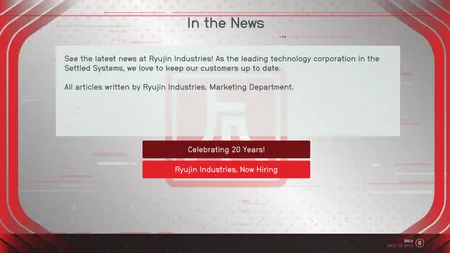
There are a lot of information kiosks in Starfield, and they suffer from a common accessibility problem — insufficient focus indicators. Here we have a kiosk with only two options, using the Ryujin Industries brand color of red. Quick question: which button is active right now? There’s literally no way to tell.
When building websites in the real world, this is a common problem. For sighted users with a mouse, highlighting a button by changing color when they hover over it is fine, because the user knows where their mouse is. But for low-vision users or keyboard users, we add a focus ring to make it clear which button is active. Ryujin Industries may have an accessibility lawsuit in their future.
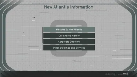
Here’s another example, from the big city of New Atlantis, one of the first places you visit in the game. Although they have the same insufficient focus indicator, it’s less of a problem because there’s more than one button, so it’s at least clear which one is colored differently. But there’s another, sneakier problem here. How many buttons are available?
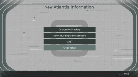
Surprise! It’s six. That’s right, there were two buttons scrolled off-screen. Now, technically, there is a scrollbar, but I can tell you that I didn’t notice it until I took these screenshots. It’s that tiny thin grey line to the left of the buttons.
This is a bad design for a few reasons. First, the thinness of the scrollbar means it’s easy to miss. The fact that it’s using the same thickness and muted grey as all the other decorative lines in the background aggravates the problem. Finally it’s on the left side, which is non-traditional for left-to-right languages.
I would suggest moving the scrollbar to the right, making it thicker and tweaking the colors to stand out a bit more. Or even consider ditching the scrollbar entirely. There’s plenty of room on the screen to show all six buttons.
Oh, and I’d get rid of those four dots at the bottom of the list. They look like an ellipsis, which makes me think I’m supposed to be able to expand it to see more, but it’s just a design element.
Perhaps because the scrollbar is so hard to notice, the designer of this next screen did away with it entirely, opting to use pagination instead.
To their credit, the pagination controls aren’t hidden away, though there are still some problems here.
They certainly don’t have enough contrast, making them difficult to read for low-vision users, and the current page indicator, like the buttons, is only indicated by a color change. This could be addressed by darkening the text on the controls and by making the active page indicator a bit larger than the others.
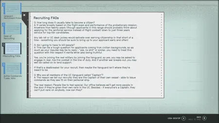
Lastly, we have a view of the standard Starfield desktop computer interface. Files and folders are shown on the desktop and can be activated to open a window showing the contents. The active file is only indicated via color, but the contrast change is strong enough that it may be sufficient.
But let’s turn our attention to the window showing the text of the file. Oh dear, our low-contrast skinny left-hand scrollbar has returned. There is (practically) no indication to the user that they’re missing the last bit of the file. The scrollbar recommendations I made before apply here, but in addition, they might consider adding a scroll shadow along the bottom to hint to the user that there’s more to read just off-screen.
I love Starfield, but I find it depressing that even in a game emphasizing hope and human achievements, they couldn’t imagine a world with accessible user interfaces.