Responsive Images the Simple Way
TL;DR: The responsive images spec is fantastic and covers a lot of use cases, but most of the time you’ll only need one: resolution switching using the `srcset` and `sizes` attributes.

Image credit: Harry Roberts
The responsive images spec is fantastic and covers a lot of use cases, but in my experience, most of the time you’ll only need to understand one of them: Serving a different sized copy of the same image depending on the user’s viewport width. We call this resolution switching, and you can accomplish it using the srcset and sizes attributes.
The logic behind displaying an image responsively is complicated. It involves determining how large the image will be displayed, as well as understanding whether the user is on a high-resolution display, among other things. Thankfully, the browser is better equipped than we are to handle this logic. All we need to do is give it some hints. We’ll use the srcset attribute to provide a list of image assets to choose from, and the sizes attribute to tell the browser how large the image will display at various breakpoints.
Oh, and don’t worry about browser support! Not only do these attributes have excellent support across the board, we’ll also be providing a fallback for older browsers like IE11.
The srcset Attribute
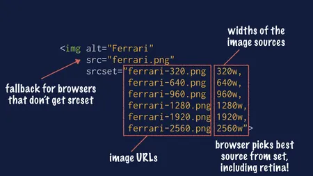
The srcset attribute provides the browser with a set of sources to choose from, and what size each of those sources is.

It’s a comma-separated list of URLs paired with widths. Each item in the list looks like this: “image.jpg 1000w,” which tells the browser that the file image.jpg is 1000 pixels wide.
By providing a collection of image assets in this way, you’re saying to the browser: “I’m giving you a list of images and I trust you to pick the best one.”
The browser will choose the best image based on a complex set of criteria including what size the image is displayed to the user at their current viewport size, and whether the user has a high-resolution display or not.
It’s smart enough to know that on a low-resolution desktop screen if the image will be displayed at 800 pixels wide, it should choose an asset from the list that is at least 800 pixels wide.
It will also know that if the image will be displayed at 320 pixels wide on a retina screen, it should choose an asset that is at least 640 pixels wide. So you don’t have to worry about 1x and 2x assets. All you have to do is provide a good set of images, and the browser will do the rest.
Not sure what image sizes to provide? See below!
The sizes Attribute
The srcset attribute is all well and good, but when the browser is reading your HTML, it doesn’t know if you’ve used CSS to scale your image to be 50% of the width of the screen.
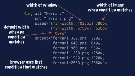
That’s where the sizes attribute comes in. It’s how we give the browser a hint about how the image will be rendered once CSS is applied.

The sizes attribute is a comma-separated list of media conditions1 paired with widths. Each item in the list looks like this: “(min-width: 1023px) 780px,” which would tell the browser that when the viewport is 1023 pixels wide (or wider), the image will be exactly 780 pixels wide.
You can also use relative widths, such as 50vw which says the image will be 50 percent of the viewport width. You can even use calc for more complex situations. For example, calc(50vw - 2rem) says the image will be 50 percent of the viewport width, minus 2rem, perhaps to account for some padding or border.
The last item on your list does not need to have a media condition. If you provide a width and leave the media condition off, then it will be treated as the default width that will be used if nothing else matches.
The browser will work its way down this list and apply the first item that matches the viewport. So given a sizes attribute of:
(min-width: 1023px) 780px, (min-width: 675px) 620px, 100vw- If the user is on a large desktop display, the browser matches the first item in the list and knows the image will be 780 pixels wide.
- A standard iPad in vertical orientation is 768 pixels wide, so the browser would skip the first item, but match the second, which says the image will be 620 pixels wide.
- A user on a typical mobile device wouldn’t match either of the first two and would land on the last one, which says the image will be 100% of the viewport width.
Of course, these are just examples, and the real world is messy. A user on a large display with a narrow window would get a smaller image. A user on an iPad Pro might get the large image when holding the tablet in landscape mode, the medium image when holding in portrait mode, or the small image if using the browser in split-screen mode. Some larger phones will qualify for the second rule when held in landscape mode. That's the beauty of this system — you don't have to think about all these form factors. You only have to consider what size image to display based on the viewport width.
Not sure what values to declare? See below!
The src Attribute
You may have noticed that all the examples I’ve provided still have a src attribute, and wonder if it’s still needed. The answer is that if you provide a srcset attribute, modern browsers will replace the src value in the DOM with the image that is selected from the srcset. So modern browsers will ignore the value you specify in the src attribute in favor of srcset.
But src is still important for browsers that don’t support responsive images. These older browsers will ignore the srcset and sizes attributes because they can’t understand them. However, they will understand the src attribute, so you can provide a single image as a fallback for them. I usually pick the smallest image that will still look good on a non-retina desktop monitor.
FAQs
How Should I Generate My Image Assets?
You can generate your images in several ways: by hand, using a responsive image generator tool, or with an image CDN.
To generate your images by hand, open the original image in Photoshop (or your editor of choice) and export it at all the sizes you want.
That can be a bit time-consuming, so you may want to use a tool to generate the images. Several tools will do this for you, but the one I like best is the Responsive Image Breakpoints Generator from Cloudinary. You upload your image, and it will automatically generate a variety of sizes for you. You can tweak the settings to control how many images it generates. Then you can download the images to use.
Another option is to host your images in a CDN, like Cloudinary or imgix. When using a service like this, you upload the highest-resolution image you have to the CDN, and then you can request resized versions of the image using URL parameters. You don’t have to do any of the work, you just tell the CDN what size you want the image to be rendered at.
What Image Sizes Should I Provide?
This is a great question! If you provide too many assets, you’re wasting your time and energy generating them. If you provide too few, then you’re forcing your users to download larger images than they need.
If you’re dealing with a single image and can provide custom markup for that image, you can use the Responsive Image Breakpoints Generator from Cloudinary. It will automatically examine your image and decide what the optimal set of assets is to provide the best balance between file size and resolution. Then it will not only generate the files, but it will also produce the srcset and sizes attributes for you.

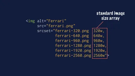
If you’re working in a CMS or web app where you don’t know the exact image that will be displayed in a slot, then I recommend picking a standard array of image sizes. In the past, I’ve used 320w, 640w, 960w, 1280w, 1920w, and 2560w because they're round numbers that follow a logical progression (multiples of 320). This set covers sizes from mobile to full-bleed desktop.
However, a standard array of sizes will always be less efficient than a customized one. In this case, while the numbers are logical, there’s a progressively larger filesize increase, because when you double the width, you quadruple the pixels. As a result, if you must choose a standard size array, you may want to consider one that has fewer assets at small sizes, and more at larger sizes.
If you’re hosting your images on Cloudinary, there’s another approach you can use, which is to take advantage of the Cloudinary API to run the Responsive Image Breakpoints Generator on the images when you upload them! Then you can take the response from the API to dynamically populate your srcset and sizes attributes.
What sizes Values Should I Declare?
You’ll need to determine what sizes to put in the sizes attribute by looking at your CSS to see how wide the image is displayed at various breakpoints.
Sometimes this is determined by the width of the image itself:
img {
  width 320px;
}

@media screen and (min-width: 37.5em) {
  width: 640px;
}
In this case, your image has two fixed sizes, which can be reflected directly in your sizes attribute:
<img
  alt="Ferrari"
  src="ferrari.jpg"
  srcset="ferrari-s.jpg 320w,
          ferrari-m.jpg 960w,
          ferrari-l.jpg 1920w"
  sizes="(min-width: 37.5em) 640px, 320px">
However, you’ll often find that your image is fluid, and inherits its width from the container:
img {
  height: auto;
  width: 100%;
}

.container {
  padding: 1rem;
  width: 100%;
}

@media screen and (min-width: 37.5em) {
  .container {
    width: 50%;
  }
}
In this example (assuming .container is the only element that affects the image’s width), you can apply the width of the container to the image. Note that we’re also subtracting the width of the padding from the container width. You may or may not need to do this, depending on how much the padding affects the overall width.
<img
  alt="Ferrari"
  src="ferrari.jpg"
  srcset="ferrari-s.jpg 320w,
          ferrari-m.jpg 960w,
          ferrari-l.jpg 1920w"
  sizes="(min-width: 37.5em) calc(50vw - 2rem),
         calc(100vw - 2rem)">
As you can see, this is going to depend greatly on your specific layout. I usually work backward by inspecting the image in my browser’s devtools to work out what breakpoints affect the width of the image.
How Can I Check That I Did It Right?
As you can imagine, testing whether you got your responsive images code right can be tricky and time-consuming. Thankfully, there’s a tool to make it easy, called the Responsive Image Linter.
It’s a bookmarklet that you add to your browser and use on your site. When you trigger it, it will automatically scan your page at a variety of different viewport sizes and pixel densities to test your images.
Then it will give you a report showing every image on your page, and whether they’re properly resizing. If they’re not, it will tell you what’s wrong and even make suggestions for how to fix it.
Conclusion
As you can see, the combination of the srcset and sizes attribute gives you a lot of bang for your buck. By adding two attributes, you tell the browser, “At this screen size, this image will be this wide, so please choose the best option from this list of images.”
There’s a lot more power available if you need to do more complicated things such as serving modern image formats like WebP or serving different images at different screen sizes. If you need details on those use cases, I strongly recommend Jason’s Responsive Images 101 series.
Learn More:
- Responsive Images 101, by Jason Grigsby
- If you’re just changing resolutions, use
srcset, by Chris Coyier - Sometimes
sizesis quite important, by Chris Coyier - The
srcsetandsizesattributes, by Ire Aderinokun srcsetandsizes, by Eric Portis- Don’t Rely on Default
sizes, by Eric Portis - The Anatomy of Responsive Images, by Jake Archibald
Footnotes
Media conditions are a subset of media queries. You can't specify a media type (like
printorscreen), but you can use the width-related queries to define breakpoints. ↩︎