What is Modular CSS?
TL;DR: Modular CSS is a collection of principles for writing code that is performant and maintainable at scale.
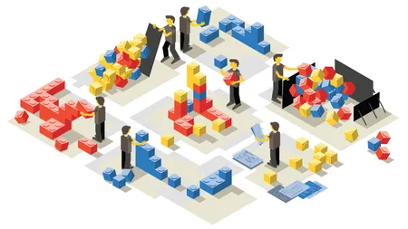
Image credit: BEM Method
Modular CSS is a collection of principles for writing code that is performant and maintainable at scale. It originated with developers at Yahoo and Yandex as a way to address the challenges of maintaining a large codebase. Some of the guidelines were controversial when introduced, but have since come to be recognized as best practices.
Table of Contents:
- CSS at Scale is Difficult
- What is Modularity?
- Modular Frameworks
- Shared Modular Principles
- FAQ
- In Conclusion, Modular CSS is Dope
CSS at Scale is Difficult
The primary problem that Modular CSS was created to solve is that CSS at scale is tricky. I love this quote from Nicholas Gallagher:
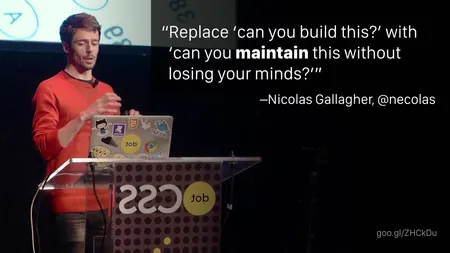
quote: Nicholas Gallagher, photo: dotCSS
That gets to the heart of the problem with CSS at scale. Writing code isn’t the challenge. Doing so in a way that isn’t going to cripple you with technical debt over time is.
Difficult to Understand
Here’s an example from the CSS Guidelines that shows the kind of problem we run into. No one but the person who wrote this code knows what it does.
<div class="box profile pro-user">
  <img class="avatar image" />
  <p class="bio">...</p>
</div>
How are the classes box and profile related to each other? How are the classes profile and avatar related to each other? Are they related at all? Should you be using pro-user alongside bio? Will the classes image and profile live in the same part of the CSS? Can you use avatar anywhere else?
There’s no way to answer those questions from here. You have to do a bunch of detective work in the CSS.
Difficult to Reuse
Reusing code can be surprisingly tricky. Let’s say there’s a style on one page that you want to reuse on another page, but when you try, you find out it was written in a way that only works on the first page. The author assumed it was living inside a particular element or that it was inheriting certain classes from the page. It doesn’t work at all in a different context. You don’t want to break the original, so you duplicate the code.
Now you’ve got two problems: You’ve got your original code and your duplicated code. You’ve doubled your maintenance burden.
Difficult to Maintain
CSS at scale can also be challenging to maintain. You change the markup, and the styles collapse like a house of cards. You want to update a style on one page, and it breaks on another. You try to override the other page, but get caught in a specificity war.
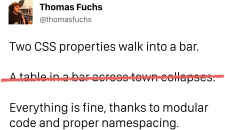
It reminds me of one of my favorite CSS jokes:
Two CSS properties walk into a bar.
A barstool in a completely different bar falls over.
What is Modularity?
So how do we solve these problems? The answer lies in the concept of modularity, but what does that even mean? Let’s start with this quote from Harry Roberts about the separation of concerns:
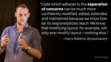
quote: Harry Roberts, photo: CSSwizardry.com
This is a common programming practice that many CSS developers aren’t familiar with. The idea is to make sure that the thing you’re writing isn’t going to do more than it was written to do unexpectedly.
Let me give you an example of the way I used to work before I learned about Modular CSS. I would get a comp like this from my designer:
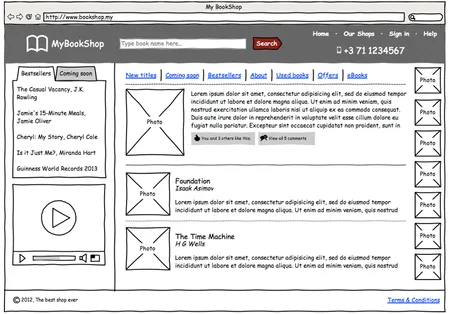
image: Yandex
I would think “Okay, I’m looking at a bookstore page. I’ve got a few widgets in a sidebar. I’ve got lists of what I assume are book covers over on the right side. I’ve got a featured book review, and I’ve got a couple more reviews below that.”
I was thinking of the page as a complete unit, and of the smaller pieces as belonging to the page. That approach is top-down thinking and results in code that’s full of one-offs and special bits that only live a single page. It’s not conducive to writing reusable code.
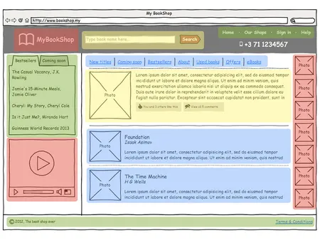
image: Yandex
What Modular CSS asks you to do is step back, and instead of thinking about this at the page level, look at the fact that your page is made up of small chunks of discrete content. This isn’t a page. This is a collection of pieces.
You’ve got a logo, a search bar, navigation, a photo list, a secondary nav, a tabbed box, a video player, etc. These are discrete pieces of content that could be used anywhere in your site. They just happen to be assembled this way on this particular page.
Modular CSS is bottom-up thinking. It asks you to start with the reusable building blocks that your entire site is constructed from.
image: BEM Method
Does that remind you of anything? It should! The Lego analogy is used by almost everyone who writes about Modular CSS for a good reason. The idea of building a UI out of standardized, easy-to-understand blocks that behave predictably regardless of context is a great concept.
One of the most famous examples of this type of block is the “media object,” defined by Nicole Sullivan. She argued that this object is one of the smallest discrete pieces of content that you’re going to find on any site.
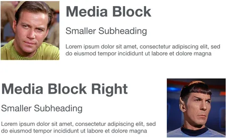
It combines a fixed width image to one side of flexible width content. You can see this everywhere. She produced a case study, called “The Media Object Saves Hundreds of Lines of Code,” that talked about applying this pattern to large-scale sites. One of her biggest examples was Facebook:
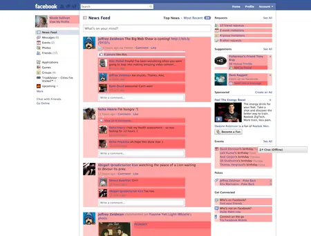
image: Nicole Sullivan
Here she’s highlighted all the media objects in a Facebook stream. There’s a profile in the upper left, the navigation elements on the right side, every post in the feed, and even the ads. Sometimes they’re nested within each other. Although they’re used for different purposes, they all share the same underlying pattern: fixed width image, flexible width text.
Her point was that when we’re talking about operating at the scale of Facebook, there’s not 10 or 20 or 30 media objects. There are hundreds or thousands on pages like this. So you can imagine that if you optimize the styles used for these repeated patterns you can save dramatic amounts of code. That leads to real performance and cost savings.
Modular Frameworks
So, now that we’re clear on the concept of modularity, let’s look at three of the biggest frameworks to have advanced the concept over the years:
OOCSS
Object-Oriented CSS, or OOCSS, was created by Nicole Sullivan in 2009, and it’s based on her work for Yahoo. It’s the origin point of Modular CSS. Her core concept was that objects are reusable patterns whose visual appearance is not determined by context.
(For those of you who are going “Yahoo? Really?” You need to understand that their front-end team was doing some really cutting-edge stuff with the YUI library at the time. In 2009, Yahoo was not a dead-end tech company.)
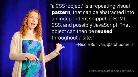
quote: Nicole Sullivan, photo: John Morrison
That’s the roots of Modular CSS, right there, as she defined it back in 2009. Beyond that, OOCSS can be boiled down to a few core principles:
Context-Independent
The first is that an object should look the same no matter where you put it. Objects should not be styled based on their context.
For example, rather than make all buttons in the sidebar orange, and all buttons in the main area blue, you should make a button class that’s blue, and a modifier that’s orange. Then your orange buttons can be used anywhere because they’re not tied to the sidebar, they’re just one of your button styles.
Skinning (aka Theming)
Another concept she talked about is how to abstract the structure of an object from the skin that is being applied.
We can return to the example of the media object. The way it looks is independent of the markup and the structure that’s defined. There’s a containing element, a fixed-width image, and the content. You can style that a hundred different ways, but the markup, the structure, is going to be the same regardless of how it looks.
Something else she advised was to create reusable classes for common visual patterns. One of her examples was that on Amazon in 2009, there were drop shadows on almost everything, and they were all just a little different. They were graphical elements all created by different artists, and they were similar, but they weren’t the same. By standardizing those drop shadows, you can optimize the code and make the site more performant.
Use Classes
She also had a principle that was very controversial at the time but has since been borne out: Use classes to name your objects and their child elements so markup can change without impacting style.
What she was getting at is that you don’t want your markup to determine your CSS. So if you change the headline from an h1 to an h4, you shouldn’t have to update your CSS. That headline should have a class on it, and that class will be applied regardless of what element you choose. For example, your navigation should be something like .site-nav not #header ul.
Don’t Use IDs
The natural corollary to “always use classes” was her recommendation never to use ID selectors. This was opposed to the common practice of the time to use IDs for namespacing and refer directly to elements nested inside them.
IDs mess up specificity because they’re too strong, but more importantly, objects are meant to be reusable. IDs are, by definition, unique. So if you put an ID on your object, you can’t reuse it on the same page and are missing the point of a modular object.
BEM
That brings us to the next big framework to help define the Modular CSS ethos. BEM, which stands for Block, Element, Modifier, was also created in 2009. It was developed at Yandex, which is like the Russian version of Google. They also operate a search engine and webmail program, so they were solving the same scale-related problems as Yahoo at the same time.
They came up with a very similar set of operating principles for how to write code. Their central concept was that blocks (what Nicole called “objects”) are made of child elements and can be modified (or “skinned” or “themed”).
Here’s how Varya Stepanova, one of the lead front-enders that worked on BEM, described it:
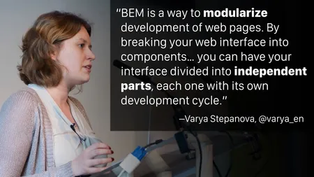
quote: Varya Stepanova, photo: ScotlandJS
BEM is made up of three parts:
Blocks
Blocks are logically and functionally independent components of a web page. The creators of BEM added a few other properties beyond what Nicole defined:
Firstly, blocks are nestable. They should be capable of being contained inside another block without breaking anything. For example, you might have a block that’s a tabbed interface widget in your sidebar, and that block might contain buttons, which are a separate type of block. The styles for your buttons and the styles for the tabbed element don’t interact with each other. It just happens that the one is nested within the other.
Secondly, blocks are repeatable. An interface should be able to contain multiple instances of the same block. Like Nicole was saying about the media object, the ability to reuse a block can result in dramatic code savings.
Elements
Elements are the constituent parts of a block that can’t be used outside of it. A good example is if you have a navigation menu, the items it contains don’t make sense outside the context of the menu. You wouldn’t define a block for a menu item. You’d have a block for the menu itself, and the menu items are child elements.
Modifiers
Modifiers define the appearance and behavior of a block. For example, the appearance of the menu block may change from vertical to horizontal depending on the modifier that is used.
Naming Convention
The other thing BEM did was to define a very strict naming convention:
.block-name__element--modifier
That looks a little complicated, so let me break it down a bit:
- Names are written in lower case
- Words within names are separated by hyphens (
-) - Elements are delimited by double underscores (
__) - Modifiers are delimited by double hyphens (
--)
This is getting a bit abstract, so let’s have an example:
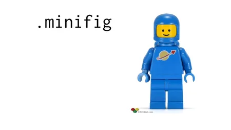
Here we have a standard Lego minifig. It’s a blue astronaut. We’ll identify it with the block class .minifig.
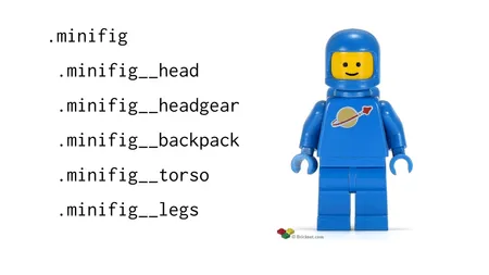
You can see that the .minifig block is made up of smaller elements such as .minifig__head and .minifig__legs. Now let’s add a modifier:
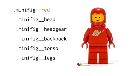
By adding the .minifig--red modifier we’ve created a red version of our standard blue astronaut.
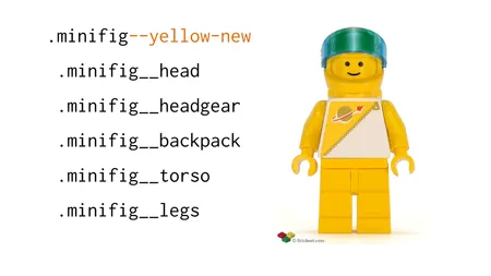
Alternatively, we can use the .minifig--yellow-new modifier to change our astronaut to the new-style yellow uniform.
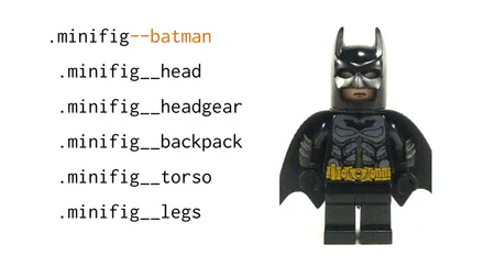
You can make more dramatic changes in the same way. By using the .minifig--batman modifier, we’ve changed the appearance of every part of the minifig with just a single class.
Here’s a more practical example of the BEM syntax in action:
<button class="btn btn--big btn--orange">
  <span class="btn__price">$9.99</span>
  <span class="btn__text">Subscribe</span>
</button>
Even without seeing any CSS, you can tell at a glance that this code will create a big orange price button. Whether you like this style with the hyphens and underscores or not, the idea of having a strict naming convention is a huge step forward. It makes code self-documenting!
No Nested CSS
Like OOCSS’ recommendation to use classes and not IDs, BEM added a few principles to how to write code. Most notably, they argue you should not nest CSS selectors. Nested selectors increase specificity, making it more difficult to reuse code. For example, just use .btn__price not .btn .btn__price.
This principle works because of their strict naming convention. We used to nest selectors to isolate them within a namespaced context. BEM’s naming convention provides a namespace, so we don’t need to nest anymore. Even though everything is a single class at the root level of your CSS, the names are specific enough to avoid conflicts.
As a rule, if a selector will work without being nested then do not nest it. The only exception that BEM allows for this rule is styling elements based on the state of a block or its modifier. For example, you might have .btn__text and then .btn--orange .btn__text to override the text color of a button when a modifier is applied.
SMACSS
The final framework we’re going to discuss is SMACSS, which stands for Scalable & Modular Architecture for CSS. It was created by Jonathan Snook in 2011. He also worked at Yahoo, writing CSS for Yahoo Mail.
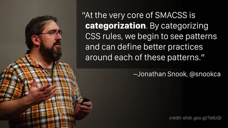
quote: Jonathan Snook, photo: Elida Arrizza
The key concept that he added, building on OOCSS and BEM, was that different categories of components need to be handled differently.
Categories
Here are the categories he defined for the types of rules a CSS system might contain:
- Base rules are default styles for HTML elements like links, paragraphs, and headlines.
- Layout rules divide the page into sections, and hold one or more modules together. They only define the layout, not color or typography.
- Modules (aka “objects” or “blocks”) are the reusable, modular parts of a design. For example, buttons, media objects, product lists, etc.
- State rules describe how modules or layouts look in a particular state. Typically applied or removed with JavaScript. For example, hidden, expanded, active, etc.
- Theme rules describe how modules or layouts look when a theme is applied. For example, in Yahoo Mail, you might apply a user theme, which would affect every modules on the page. (This is really specific to apps like Yahoo. Most sites won’t use this category.)
Naming Convention Prefixes
The next principle he introduced was using prefixes to differentiate between categories of rules. He liked the idea that BEM had a clear naming convention, but he wanted to be able to tell at a glance what type of module he was looking at.
l-is used as a prefix for layout rules:l-inlinem-is used as a prefix for module rules:m-calloutis-is used as a prefix for state rules:is-collapsed
(There’s no prefix for base rules because they’re applied to HTML elements directly, without using a class.)
Shared Modular Principles
These frameworks are more alike than they are different. I see a clear path from OOCSS to BEM to SMACSS. Their evolution represents our industry’s growing experience with performance and writing CSS at scale.
You don’t need to pick just one. Instead, let’s try to define the universal themes of Modular CSS. Let’s see what these frameworks share and keep the best parts.
Modular Elements
A modular system is composed of these elements:
- Module: (aka object, block, or component) a reusable and self-contained pattern. Examples include media object, navigation, and page header.
- Child Element: a discrete piece of a module that can’t stand alone. Examples include media object image, navigation tab, and page header logo.
- Module Modifier: (aka skin or theme) alters the visual appearance of a module. Examples include left/right aligned media objects, vertical/horizontal navigation.
Modular Categories
Styles in a modular system can be organized into the following categories:
- Base rules are default styles for HTML elements. Examples:
a,li,h1 - Layout rules control how modules are laid out, but not visual appearance. Examples:
.l-centered,.l-grid,.l-fixed-top - Modules are visual styles for reusable, self-contained UI components. Examples:
.m-profile,.m-card,.m-modal - State rules are added by JavaScript. Examples:
.is-hidden,.is-collapsed,.is-active - Helper (aka utility) rules are small in scope and independent of modules. Examples:
.h-uppercase,.h-nowrap,.h-muted
Modular Rules
When writing styles in a modular system, follow these rules:
- Don’t use IDs
- Don’t nest CSS deeper than one level
- Add classes to child elements
- Follow a naming convention
- Prefix class names
FAQ
Doesn’t this mean my HTML has lots of classes?
The first objection I often see raised to a Modular CSS approach is that it can result in many classes in your HTML. I think this is because it used to be considered a best practice to avoid having too many classes in your markup. Nicole Sullivan wrote a great blog post called “Our (CSS) Best Practices are Killing Us” back in 2011, explicitly refuting this idea.
One option I see some devs advocating is using a preprocessor’s extend function to concatenate multiple styles into a single class name. I would recommend against this, because it makes your code less flexible. Instead of allowing other devs to combine your lego bricks in new ways, they’re stuck with the few combinations you’ve defined.
But BEM Class Names are Long and Ugly!
Don’t be afraid of long class names. They’re self-documenting! When I see BEM-style class names (or any other modular naming convention), I appreciate the fact that I can tell at a glance what these classes are intended for. It’s like a paper trail in your markup.
What’s the Naming Convention for a Grandchild Element?
Long story short: There’s no such thing.
Newcomers to Modular CSS quickly grasp the idea of child elements: minifig__arm is a part of minifig. However, sometimes they get hung up on matching their DOM structure in the CSS, and they ask how to indicate further levels of nesting, like minifig__arm__hand.
There’s just no need for this. Remember that the idea is to separate your styles from your markup. It shouldn’t matter whether hand is a direct child of minifig or nested several levels deep in the DOM. All the CSS cares about is that hand is a child of minifig.
.minifig {}
  .minifig__arm {}
      .minifig__arm__hand {} /* don't do this */
  .minifig__hand {} /* do this instead */
What About Module Conflicts?
Another thing that Modular CSS newbies tend to get concerned about is conflicts between modules. e.g., if I apply both the l-card module and the m-author-profile module to the same element, will it cause a problem?
The answer is that ideally, modules shouldn’t overlap much. In this example, the l-card module is concerned with layout, while the m-author-profile module is concerned with styling. You might see l-card set width and margins, while m-author-profile applies a background color and font.
Your daily reminders that components aren’t about reuse, they’re about isolation.
Reuse is a useful emergent property of isolation.
One way to test that your modules are properly isolated and don’t conflict is to load them in a random order. You may be able to configure your build system to shuffle the module stylesheets at build time. If you start seeing bugs, you’ll know that you’ve got CSS that expects to be loaded in a specific order.
If you find that you need to apply two modules to the same element and they are conflicting, consider whether these are really two separate modules. Perhaps they could be collapsed into a single module with a modifier?
The final exception to the rule is that “helper” or “utility” classes will likely conflict, and in these cases, you can safely consider using !important. I know, you’ve been told !important is evil, and should never be used, but let’s apply a bit of nuance: Using it proactively to ensure a helper class always wins a specificity battle is fine. (Harry Roberts has more to say on this topic in the CSS Guidelines.)
In Conclusion, Modular CSS is Dope
Let’s have a brief recap. Remember this?
<div class="box profile pro-user">
  <img class="avatar image" />
  <p class="bio">...</p>
</div>
How are the classes
boxandprofilerelated to each other? How are the classesprofileandavatarrelated to each other? Are they related at all? Should you be usingpro-useralongsidebio? Will the classesimageandprofilelive in the same part of the CSS? Can you useavataranywhere else?
Now we know how to address all those concerns. By writing Modular CSS and using a proper naming convention, we can produce self-documenting code:
<div class="l-box m-profile m-profile--is-pro-user">
  <img class="m-avatar m-profile__image" />
  <p class="m-profile__bio">...</p>
</div>
We can see which classes are and are not related to each other, and how. We know what classes we can’t use outside of the scope of this component. Also, we know which classes we are free to reuse elsewhere.
Modular CSS simplifies code and facilitates refactoring. It produces self-documenting code. It results in reusable code that doesn’t influence outside its scope.
Or to put it another way, Modular CSS is predictable, maintainable, and performant.
Now we can revisit that old joke, and make a slight change: