Posts tagged “design”
-
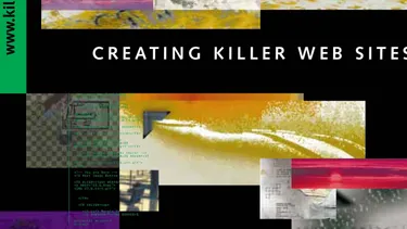
Do Siegel’s Seven Deadly Sins Hold Up?
In 1996, David Siegel’s book Creating Killer Web Sites was at the top of the charts on Amazon, and it quickly became the gold standard of web design books. Siegel may not have been the first to write...
-

Trust Your Designer, But Review Their Code
Clearly defined responsibilities allow everyone to use the best tools for the job and ensure everyone’s work is held to the highest standard.
See all tags.