Scott Vandehey’s Portfolio
I'm a front-end architect and CSS specialist in Portland, Oregon with over 20 years of experience building scalable user interfaces. My specialty is refactoring large code bases for maintainability and performance, and helping teams define best practices and workflow around CSS development. Between my education in graphic design and my experience working alongside programmers, I bridge the gap between design and development.
A running theme in my career has been helping others level up, and that’s most recently manifested in the Friday Front-End and CSS Basics newsletter and social accounts, which I use to share development tips and links with the front-end community every day. My first book, “How to Find a Better Job in Tech,” was published in 2016.
Specialities: Web Standards, CSS, HTML, JavaScript, Vue, Nuxt, Svelte, Sass, BEM, SMACSS, OOCSS, Mobile-First, Responsive Web Design, Refactoring, WordPress, Browser Testing, Scrum
If you like what you see, here's my linkedin profile, my resume, or feel free to email me. You can also find me as @spaceninja just about everywhere, including github, codepen, mastodon, and bluesky.
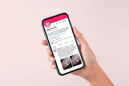
Friday Front-End
I started an email newsletter and twitter account in 2015 to share a curated list of CSS-oriented front-end links with my peers. I was already reading a broad selection of blogs and newsletter to stay up-to-date, and posting those to my own bookmark list. Every week, I post five links and a video to the twitter account, and then compile those links into the newsletter (sent on Friday, naturally). In 2018, I added a second twitter account, @cssbasics, specifically to share links aimed at beginners.
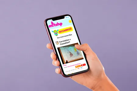
MLTSHP
In 2017 I joined a team that was working to save the image sharing community site MLKSHK. The original creator handed us the source code, and we moved it to a new name, MLTSHP. Together with a designer and a developer, I worked to modernize the front-end code for the site. I overhauled the layout to be mobile friendly, created a pattern library, added a dark mode, and helped add a new payment processing workflow.
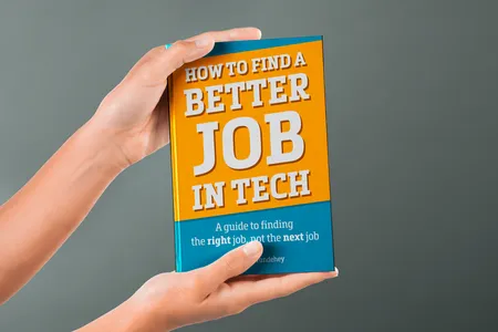
How to Find a Better Job in Tech
In 2016, I self-published an e-book about finding a better job in the tech industry. The book grew out of a conversation with a friend over coffee, who asked for career advice. The advice seemed helpful, and turned into the outline of a short book. The experience of taking my unorganized thoughts and converting them into a coherent narrative longer than a blog post or essay was interesting. I learned the value of editing, and how to make space for a large side project without sacrificing existing work and family commitments.
Tempest CMS
Starting in 2015, I signed on with Say Media to work on their CMS, Tempest. Over the next three years, I led a complete refactoring of the CSS codebase, resulting in dramatic file size savings. I applied modular CSS standards, based on SMACSS and BEM, and updated the UI to be mobile-first and fully responsive. I helped define the company's CSS code standards and added a linting tool to enforce them. I created a Bootstrap-style pattern library to help developers quickly add new features without having to write custom styles. I also led an effort to use responsive images throughout the app during a team-wide performance project.
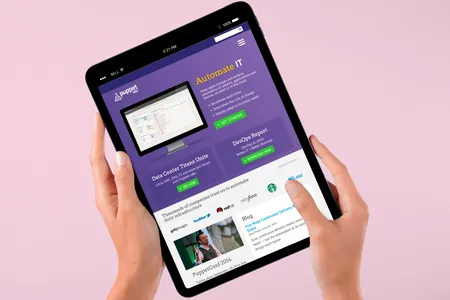
Puppet Labs
In 2013 I joined the marketing team at Puppet Labs, with a mandate to completely overhaul the company's site. In addition to switching the back-end from WordPress to Drupal, I worked with the UX team to overhaul the design with an adaptive layout and an emphasis on retina-quality imagery. I increased front-end maintainability by using Sass to create a styleguide and pattern library. After the site launched, my efforts shifted to working with other teams in the company to create Drupal workflows to increase their productivity and make it as easy as possible for teams to keep their portions of the site updated.
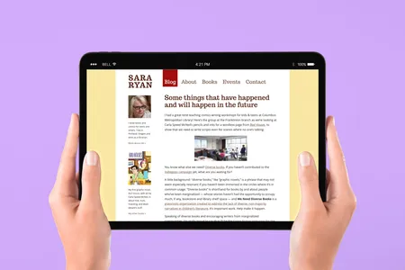
Sara Ryan
Local Portland novelist Sara Ryan contacted me in 2012 to redesign her site. The overall look was intended to feel more clean and professional, with an emphasis on typography and fewer distractions (like social media sharing links). In particular, the books page was redesigned to emphasize her novels, while allowing her to feature comics and anthology work in a more clear way. This project took place over several months, beginning with wireframes and proceeding through Photoshop comps to a full WordPress theme.
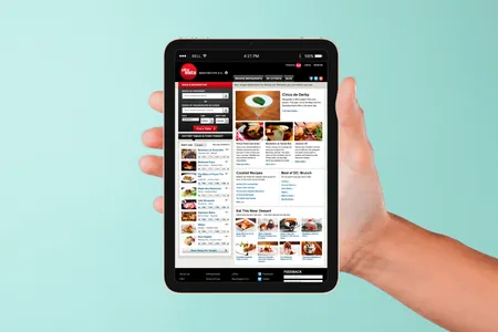
CityEats
In 2011, I joined the team at Burnside Digital building CityEats, a restaurant reservation and review site for Scripps Network, the parent company of the Food Network. For the first six months, I was the sole front-end developer, responsible for implementing the entire theme. I built a styleguide, constructed reusable classes the developers could easily add to style pages without needing to know much CSS, and worked closely with the design team. I also built out a complete set of mobile web styles and coordinated the front-end team as it grew.