Posts tagged “css”
-
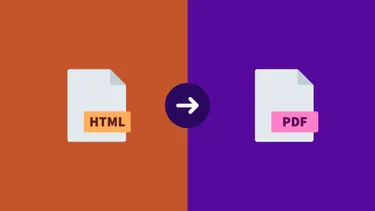
How to Create a Website and a PDF from the Same Codebase
Let's build a website and generate a PDF from the contents using basic CSS and a PDF generation API.
-

Friday Front-End’s Top Links of 2023
In 2023, Friday Front-End shared a curated list of five articles and one video every week. Here are the links that were most popular.
-
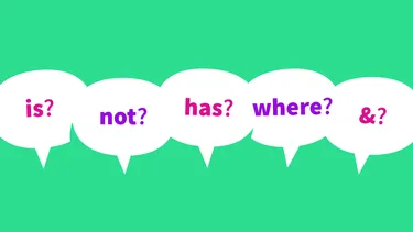
Surprising Facts About New CSS Selectors
I set out to learn a bit about how CSS nesting works, especially the new & selector, and I ended up on a deep dive into the :is() selector and its siblings.
-

When to Nest CSS
CSS nesting is great, but should be used with caution. As a rule, if a selector will work without being nested, don’t nest it. However, there are certain situations where nesting can make things easier to understand.
-

Highly Customizable Background Gradients
How to create a complex but highly customizable background gradient that can be modified easily using CSS custom properties.
-

The Power of CSS Blend Modes
I knew CSS blend modes could create some cool effects, but even so, a CodePen I saw recently left me shocked at what they’re capable of.
-

Resetting Inherited CSS with “Revert”
For a recent project, we needed to take a small web application and embed it inside a client’s existing site. Typically, this means inheriting the site’s styles. However, in this case, the client...
-

Modern CSS in a Nutshell
A friend recently shared his frustration with CSS development. I responded to him with a high-level overview of the current state of CSS. If you’re feeling a bit out of touch with modern CSS development, I hope this helps. You’d be surprised how much you can do with vanilla CSS nowadays!
-
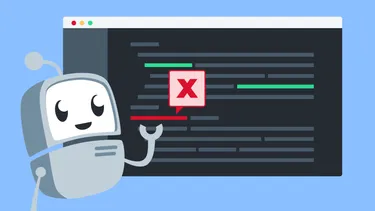
Code Linting for Web Designers
You may have heard that you should be “linting” your code. What does that mean? Why would you want to do it?
-

Friday Front-End’s Top Links in 2018
In 2018, Friday Front-End shared a curated list of five articles and one video every week. Here are the links that were most popular.
-

What is Modular CSS?
Modular CSS is a collection of principles for writing code that is performant and maintainable at scale.
-

Front-End Newsletters
A friend recently asked me how I keep up-to-date on what's happening in the front-end community. It's a great question. It used to be that RSS feeds were the way to go. I'd subscribe to the feeds from...
-
How to Define CSS Standards for a Team
“We’re going through a major redesign of our app and every page is given to one person on the team to complete from end-to-end, including creating the HTML structure and styling, and everyone is...
-

Code Verbosity
If breaking a shorthand up makes the code more readable, that's a trade-off I'm willing to make… especially after seeing the alternatives.
-
What IS Flexbox?
An elegant layout method for a more civilized age.
-

The Many Exciting CSS Limits of Internet Explorer
IE has a number of limits in the way it loads CSS, which can cause your styles to not be applied if you exceed them.
-

How to use @font-face to avoid faux-italic and bold browser styles
Did you know that if you declare a custom font, the browser will try to fake the bold and italic styles if it can't find them?
-

How to avoid paragraph gaps when using superscript and subscript
The default superscript and subscript styles leave awkward gaps in the text, but you can easily fix the problem with just a few lines of CSS.
See all tags.